
Insightful Power BI Solutions

Insightful Power BI Solutions · 08. June 2025
Geht es um Dashboards, glauben viele Unternehmen noch immer: „Viel hilft viel.“ Also wird alles, was an Daten verfügbar ist, in Dashboards gepackt – in der Hoffnung, dass mehr Informationen automatisch zu besseren Entscheidungen führen. Klingt erstmal logisch, oder? Führt aber in Entscheidungssituationen zu Verzögerungen und Ablenkungen. Wie Sie durch strukturiertes Anforderungsmanagement Abhilfe schaffen können erfahren Sie im Artikel.

Insightful Power BI Solutions · 29. January 2025
In this Blog article, I am providing helpful tips & tricks for Challenge 23 of FP20. I will show you a smart way to transform the data model to make your life easier, and in Part 2, I will also show you how to create a dashboard that provides a general overview.
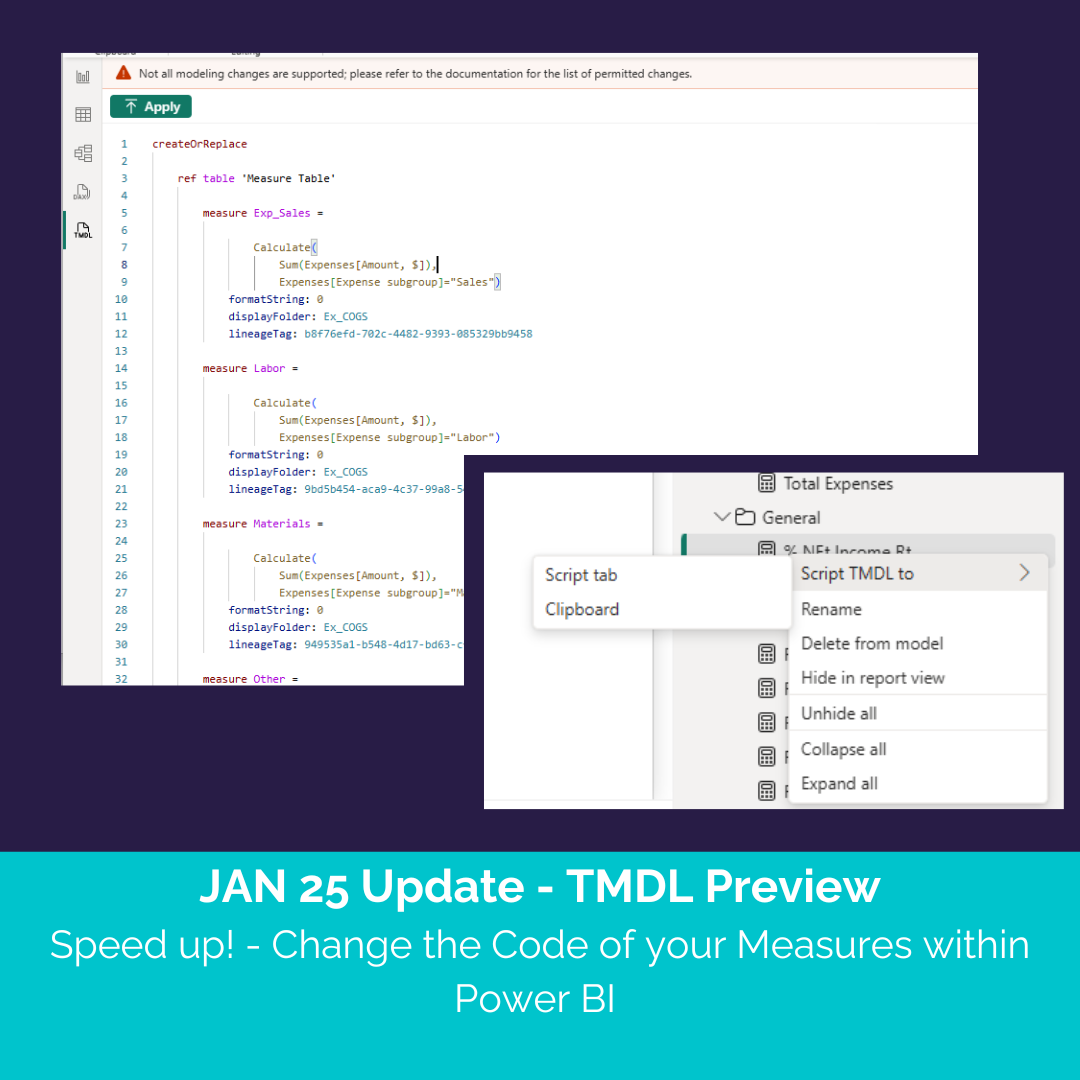
Insightful Power BI Solutions · 18. January 2025
The DAX Query View has already been a game-changer for streamlining batch editing directly within Power BI. With the TMDL Preview in January 2025 update, Microsoft has taken this functionality to the next level. You can now edit and apply changes to your measures directly in Power BI, making the process even faster and more efficient.
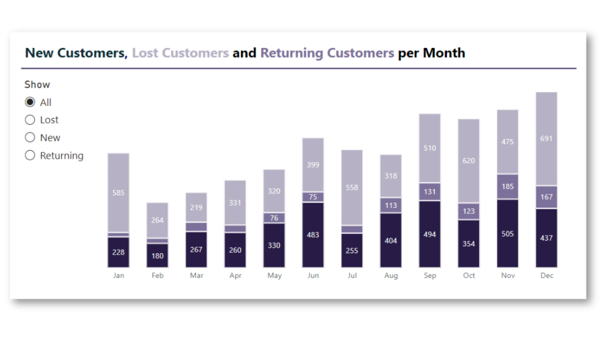
Insightful Power BI Solutions · 16. January 2025
Stacked bar charts in Power BI can be frustrating when data labels overlap and become unreadable. A simple solution? Enable a series display option without touching bookmarks!
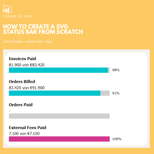
Insightful Power BI Solutions · 14. January 2025
Using SVGs in Power BI is a game-changer when it comes to creating custom visuals. For example, I designed a progress bar that already includes text and a percentage, something that would require multiple visual elements if done with native Power BI visuals.

Insightful Power BI Solutions · 14. January 2025
Is Tableau better than Power BI for design? Many people claim it is, but I disagree! With the right tips and tricks, Power BI can be just as powerful as Tableau for creating well-designed visuals. In this article I will show you how to recreate the famous KPI cards from Andy Kriebel with native visuals in Power BI.
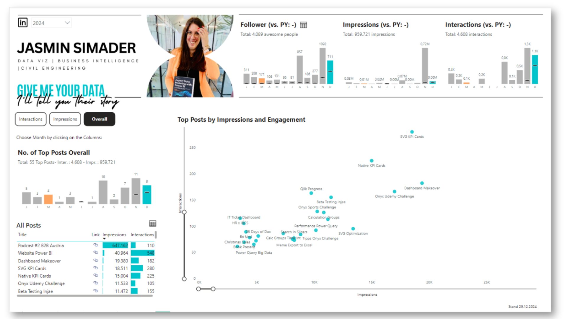
Insightful Power BI Solutions · 13. January 2025
Analyzing LinkedIn data can actually be pretty much fun! It’s a chance to turn all those connections, posts, and activities into something visual and meaningful. And it is a pretty easy way to track your content performance and build your personal brand.